A magical promise of releasing your data and keeping everyone's privacy

Differential privacy is one of those ideas that sound impossible. It is a mechanism outputting information about an underlying dataset while guaranteeing against identification attempts by any means for the individuals in the data [1]. In a time when big data is so hyped on one hand and data breaches seem rampant, why aren't we hearing more about differential privacy (DP)?

I quote Moritz Hardt from his blog:

To be blunt, I think an important ingredient that’s missing in the current differential privacy ecosystem is money. There is only so much that academic researchers can do to promote a technology. Beyond a certain point businesses have to commercialize the technology for it be successful.

So what is differential privacy? First of all, DP is a constraint. If your data release mechanism can satisfy that constraint, then you can be assured that your data is safe from de-anonymization. DP came out of Microsoft Research initially and it's been applied in many different ways. There are DP implementations for machine learning algorithms, data release, etc. Here's an explain-like-I'm-5 description courtesy of Google Research Blog on their RAPPOR project, which is based off of DP.

To understand RAPPOR, consider the following example. Let’s say you wanted to count how many of your online friends were dogs, while respecting the maxim that, on the Internet, nobody should know you’re a dog. To do this, you could ask each friend to answer the question “Are you a dog?” in the following way. Each friend should flip a coin in secret, and answer the question truthfully if the coin came up heads; but, if the coin came up tails, that friend should always say “Yes” regardless. Then you could get a good estimate of the true count from the greater-than-half fraction of your friends that answered “Yes”. However, you still wouldn’t know which of your friends was a dog: each answer “Yes” would most likely be due to that friend’s coin flip coming up tails.

Googles Chrome uses RAPPOR to collect some sensitive data that even Google doesn't want to store because of end-user privacy risks [2]. With the use of DP, they're able to get access to some useful data that they wouldn't have been able to otherwise.

By this point, I hope you have a sense of what DP is and why it's useful. But how does it work? Luckily, I found out that Moritz open sourced his MWEM algorithm on Github. Then I spent a couple weekends deploying his Julia package and built a web application around it.

masking.io homepage

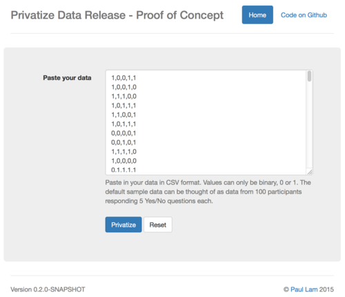
The site is live at masking.io (note the unsecure HTTP). Give it a try! It doesn't do much yet though.

masking.io is a weekend hack so I'm not sure if I'll do anything more with it. Email me if you think this can be useful to you. For now the app only takes binary values. So pretend your data are all Yes/No responses. The app can be patched to take in any numeric data. Moritz describes how to do that in his paper [3] and he's open to sharing his existing C# code for reference.

The way the web application works is by exposing Moritz's package as a Restful API using Morsel.jl. The frontend is done with Clojurescript's Reagent. I couldn't find any PaaS that can run Julia applications so I containerized the Julia part in Docker and deployed it. That was a bit annoying to do as I kept finding bugs and had to submit a few patches on the way. I guess not many people are deploying Julia applications yet.

The whole stack is open sourced: web application, DP micro-service, and MWEM algorithm. Let me know of your thoughts.

References:

  1. Ji, et al., Differential Privacy and Machine Learning: a Survey and Review, arXiv:1412.7584 [cs.LG]
  2. Erlingsson, et al., RAPPOR: Randomized Aggregatable Privacy-Preserving Ordinal Response, arXiv:1407.6981 [cs.CR]
  3. Hardtz, et al., A simple and practical algorithm for differentially private data release, arXiv:1012.4763 [cs.DS]

With thanks to Chris Diehl for bringing DP to my attention.

What I learned from 2 years of 'data sciencing'

Last week was my last one at uSwitch.com. From becoming aware of ‘data scientist’ as a valid job title on my job offer letter, to speaking at Strata London, to signing a book deal, to writing about it in our book on Web Data Mining (that's progressing at a glacial pace), I figured that I should jot down some takeaway lessons while this experience was still fresh.

It's not about the science but the data.

In my first year our team delivered a handful of data projects. For example, we developed a dashboard showing lifetime values for all of our millions of customers, demonstrated a 6 percent revenue gain with a product showcase sorting algorithm modeled by the multi-armed bandit problem, and simulated offline advertising impacts to online sales for optimising marketing spending, thereby saving £20,000 a month. For various reasons, however, none of these projects gained traction within the company and were abandoned.

Much of the effort spent on those projects was in getting the right data into the right shape. We needed to capture events across applications on different technology stacks, associate individual events to unique customers, and be able to process all that data in an ad hoc manner. Over the course of my first year, our team of two built and evolved a distributed data architecture and scalable data workflow based on open source tools and publications from companies like Google, LinkedIn, Twitter, etc. In fact, I scratched enough of my own itch on an open source big data processing project to become one of the maintainers for it.

On a rather "by the way" note, we structured lifetime views of customer data from the disparate signals across company verticals. Word had been going around the company that we had this new business intelligence tool, and more and more people asked us to help them answer questions with data on their side of the business. The data we surfaced from our data workflow satisfied a widespread need in the company to understand customer behaviours. Little did I know that we'd be cleaning and shaping data for most of my second year at uSwitch. Following that, our commercial team released an external data product that I can't say much about, but which might bring in sizable benefits for the company soon.

It is glamorous to talk about the latest and greatest machine learning or data visualisation. In practice, I was just cleaning and shaping data. Enabling more people to make use of deep and structured data was the part that delivered value to the company.

Figuring out the right problems to solve is not easy.

Had we known that customer behaviour analytics were so valuable, we would have done that work earlier on (although many of the other projects were definitely a lot of fun to do). Figuring out the right work to do is one of the most difficult tasks for a data science team. The fact that the data science role is so vague doesn't help. The marketing crew think we are mining for customer insights. Developers think we're toying with Riemann, Storm, or something bleeding edge. Product managers think we are plotting graphs.

Everyone had ideas but there were only three of us in the team. Figuring out where to devote our time and effort is not as easy as it sounds. The issue is that a new project can be almost anything. So which one should we do? The plethora of choice can be confusing.

Seeing that this is data science, why not dive right into the data like they would often say in hackathons? I made the mistake in the first few weeks of my data science career of hacking away at the data and then trying to persuade people to make use of the result ... somehow.

Some interesting graphs came about. But as Marc often likes to ask, "so what?" Unless someone or something can act on the data, results can only satisfy intellectual curiosity. A business can't survive by funding people to carry out academic studies forever.

Nowadays, we talk to different stakeholders to try and dig as deep as possible into their needs before writing any code for a new project. This is me handwaving. Frankly, I'm still learning my way and rely a lot on luck through trial and error in discovering the right problems to solve.

It is a humbling experience.

Working with Paul Ingles and Abigail Lebrecht has been frustratingly awesome. Paul is opinionated about doing things as simply as possible. On more occasions than I can remember, we implemented our own little Clojure libraries because the open source ones available were "trying to do too much". Abigail was adamant about getting the data and analyses right. "What do you mean this data is only 99 percent correct?" Working day in and day out with Paul and Abigail showed me that I still had much to learn in efficient problem-solving and taught me to question all hidden assumptions.

In my previous role as a biomedical engineer, I also had the opportunity to work in a multidisciplinary team. But for my haptic-robotic therapy project, I never even considered going into a workshop to build my robot or provide clinical therapy for the stroke patients. What "multidisciplinary" meant back then were a small group of professionals coming together to work on a project with each person doing different tasks to get the thing to work.

The advantage of being a data scientist was that I was very hands-on in all aspects of the work. One week I might be pair programming with Paul, and fighting to keep him away from my keyboard, another week, integrating Riemann to monitor our data architecture. Other days I was debating with Abigail on the data mining side. That usually resulted from her finding flaws in the materialised tables that I produced from Cascalog, and then I would have to come up with a better estimation model for the missing data.

So do you want to be a data scientist?

This is it for me formally as a data scientist. I am moving back across the Atlantic to the States to co-found a new venture and continue my journey to make information accessible. Now back to the topic at hand. If cleaning vast amounts of data, being clueless as to what to do, and debating with brilliant colleagues all add up to a challenge that you want to take on, I know a company in London that's looking for a data scientist!

Post gone viral, 16000 visitors in a day, how many actually read the article?

Edit: A few people have pointed out that my assumption about the Analytics engagement metric might be wrong because single page hit could be counted as zero on engagement time. I'll make an update to this post when smarter people than me on HN can agree on a metric. So I open this problem to Analytics expert, how can I discern readership ratio from Analytics data?

My reminiscing post about my time as an aerospace engineer versus software was on the front page of Hacker News for about 12 hours on Friday. That garnered 16,374 unique visitors to this site on that single day. However, Google Analytics data say that only 975 of those people spent more than 10 seconds here. Given that there's 652 words in that viral post, I doubt anyone can actually read it within that time. If we assume that only people spending more than 10 seconds have meaningfully read the article, it appears that only 6% of traffic are real readers from this Hacker News blitz.

Viral post visitors engagement

Given that my usual stats is above 10%, viral traffic audience is understandably less targeted but isn't abysmal by comparison. However, as a data scientist, I'm obliged to say that as this is an one-off event, we couldn't draw a statistically significant observation from it.

Interestingly, overall traffic the day after on Saturday is back down to 901 visits. And engagement for those spending more than 10 seconds is up at 8.3%. These residual traffic are coming in from domains like Twitter and link sharers.

Unconfusing false-positive and false-negative statistical errors confusion

I was reading a blog post about real-time analytics over the lunch today. In it, the author made a claim that "funny business with timeframes can coerce most A/B tests into statistical significance." There's also this plot illustrating two time series of the cumulative number of heads in a two-fair-coin-comparison. Yet, time nor ordering has an effect on test results because each flip is independent. Not content with his claim, I wrote a coin flipping simulation in R to prove him wrong.

This plot shows p-values of proportion tests for two simulated fair coin flips that they are different. Each of these tests are repeated with increasing number of flips per test. Since both coins are fair, we should expect no p-value should dip below our 95% significance level (red horizontal line). Yet we're seeing some false positives (i.e. a claim of evidence when there really isn't) that say the two coins are statistically different.

false positive vs sample size, up to N=1000

A better illustration is to run a test with 1000 flips, get a test result, and repeat many times for many results. We see that sometimes false positive happens. Given that our significance level is 95%, we can expect false positives to happen 1 in 20 times.

repeated sampling at 1000 flips

Remembering that I should do a power calculation to get an optimal sample size, doing power.prop.test(p1=0.5, p2=0.501, power=0.90, alternative="two.sided") says N should be 5253704.

So this is a plot of doing many tests with 5253704 flips each.

N=5253704

But the false positives didn't improve at all! By now, I'm quite confused. So, I asked for help on StackExchange and received this insight.

What's being gained by running more trials is an increase
in the number of true positives or, equivalently, a decrease
in the number of false negatives. That the number of false
positives does not change is precisely the guarantee of the test.

And so, a 95% significance level remains 95% significant (1 in 20 chance of false positive) regardless of increasing sample sizes as shown. Again.

false positive up to 10k trials

What is, in fact, gained for increasing sample size is reduced false negative, which is defined as failing to make a claim when it is there. To illustrate that, we need a different plot because it is an entirely different circumstance. We have two new coins, and they are different.

Say we have one fair (p=50%) coin and another that's slightly biased (p=51%). This plot shows the result of running the same proportion test to see if these two are statistically different. As we increase sample size, the amount of false negative results, points above the red line (0.05 p-value, 95% significance level) denoting negative results, are clearly reduced as sample size increases. Thus this plot is illustrating that false negatives decreases as sample size increases.

false negative increasing samples

"Funny business" do not coerce A/B tests into statistical significance. The fact that a 95% significance gives 1 in 20 false positives is in fact what it guarantees. To decrease false positive, simply test at a higher significance level. For example, prop.test(c(heads.A, heads.B), n=c(N, N), alternative="two.sided", conf.level=0.99) to set it to 99% instead of the default 95%.

The R source code for this mental sojourn are available at this gist on Github.

continue   →