
Given the proliferation of open source cluster managers (for example, Mesos and
Kubernetes) and PaaS software (for example, Deis and Dokku), the infrastructure
layer is being abstracted further away from the application. The result is a
cleaner separation between development and operation. The simplest example is
probably Dokku. You install Dokku on a server, then git push to deploy your
applications. That's it. Just as you would do on Heroku. There are no Puppet
or Chef scripts to mess with to deploy your app. Given the freedom that these
tools provide for less demanding deploy workflow, I've decided to try another
Infrastructure as a Service.
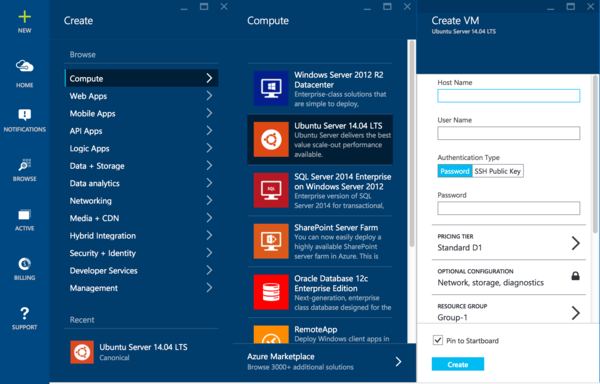
I spinned up a Ubuntu 14.04 virtual machine on Azure, set up Dokku on it, and deployed my applications for a data privacy project. From account sign up to a running stack took less than an hour. There were no surprises, and the process was straightforward. Sign up for an account, then follow the instructions. Once you're in the portal, click on the giant New button to create a virtual machine. The UI itself guides you step-by-step through a horizontally expanding panel. Don't Make Me Think. I like it.
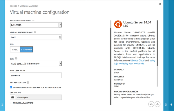
I have to point out that the UI I'm showing is a preview for the next portal version. Compared to Azure's old UI, the improvements on both function and esthetics are evident. For example, in the old UI, they had a quick create for Ubuntu machines, but using that would mean you could only log in with a password. Which is bad practice. If you want to use an SSH key, you need to go through the detailed settings (screenshot below), which aren't apparent for a user to try. You can't use an RSA key either, and need to upload an X.509 certificate. The new UI has neither of those problems. There are a few small annoying quirks like that in the old UI. I would recommend anyone trying Azure for the first time to use the Preview Portal. You can opt-in at your Account menu on the top right.
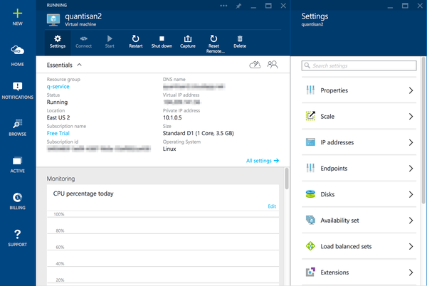
Once your VM is up and running, which took less than a minute for me, the instance view (back to the new portal preview) is informative and clean. Grab the SSH information from there to connect, and you're in. I'm impressed by the fact that information which I would want to see on each page is exactly where it should be. It's like Microsoft made the effort to think about the UX.
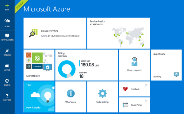
Navigating to the Home dashboard, you can recognize Microsoft's signature Metro design. And guess what, billing information is right there! No need to jump to another part of the site like on AWS.
As much as I like the Azure management portal, in reality it might not be the best choice for many ops people. If you're an ops person spending most of your time on the web management console, then you're probably doing it wrong. For my use case of spinning up a server or two to host personal projects every now and then, the management UI is a convenient tool to have. Azure seems to beat AWS on the web design. However, if that's your use case, you probably don't need an IaaS and would get better value with a smaller provider like Linode or Digital Ocean.
I haven't had the chance to use Azure much yet. Anyway,the server is still up and running after a week. I haven't needed to tinker with it , which is a good thing. The obvious negative at the moment is that the free trial only lasts 30 days. Other than that, so far so good.